Such a thing happened to me recently with my friend Christine. She is a tremendously talented Chicago-based photographer and I've been lucky enough to be assisting her on some weddings this summer. Here is a shot from the wedding we did Saturday. (I know. Seriously amazing.) Check her out at www.christineotte.com.

She even did the photos for Patrice's wedding a few years ago, which were stunning!


Things such as this coffee table. When I walked into her apartment a few months ago my eyes went directly to it, and I then begged her to let me share with my readers. She took a standard black Ikea-find, to fun Starbucks-laden beauty.

She arranged some old Starbucks gift cards in a fun puzzle-pieces format and then glued them down.

She ran a strip of blue painters tape around the edge of the table and then poured on a thick layer of Envirotex which you can see here.

This sealed seal the cards down, filled in the cracks, gave the table top a thick protective layer and a high gloss finish. Super cute and fun!
My head was swimming in ideas after seeing this. Wouldn't this be an amazing way to display a collection? I have a bunch of ticket stubs, brochures, and other knick knacks from traveling, and have been thinking about how this would be a great way to both protect and show them off!
They also had some crazy checkered flooring in their kitchen that was driving them crazy.
Christine turned to Traffic Master Allure's Vinyl Plank Flooring for an amazing transformation.
Here is the description from the website, I'm roped right in by the easy installation-especially the interlocking edge design and that no adhesive is needed! A huge improvement, huh?
Easy GripStrip installation Lays directly over your old floor; no floor prep or messy glue needed! Looks and feels like real wood feel the knots! Completely waterproof. Perfect in high moisture areas basements, kitchens, and bathrooms. Warm comfort and quiet under foot. Install an entire floor cleanly, easily in just a few hours. 25 year residential warranty.
- American Walnut Finish
- Super durable and completely waterproof
- Unique interlocking-edge design for simple installation
- Simply lay overlapping GripStrip of one plank on adjacent plank and press together No other adhesive required. Minimal trimming involved Just score and snap!
She purchased these from Home Depot, which you can see here if interested. She just tucked the edges under the existing trim, so it looked like the apartment had come with this lovely flooring.
Aside from this project being relatively easy and highly efficient, I just keep thinking how great it is for people in temporary living situations, because the whole thing just pops right off when it's time to move out. This fix is definitely grumpy landlord-friendly.
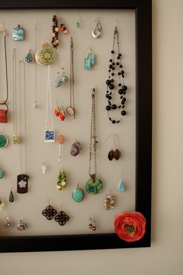
I was also pleased to see that she was sporting an adorable jewelry holder.
She simply secured a screen to a large empty picture frame. It's functional and laden with cute accessories, so it looks like an art piece. Enough said.
Aren't these ideas great?! I hope you like them as much as I do!! If you want to become of fan of Christine Otte Photography on facebook, you can do so here. I can assure you that you won't be disappointed!!
Happy Wednesday everyone!


Amazing photos and great ideas! Really clever jewelry display. Love the look and efficiency.
ReplyDeleteWow! The photography makes me want to stage my wedding all over again just for the pictures!! haha! I love all of her amazing ideas...so neat!!
ReplyDeleteShe has some seriously fun ideas! The Starbucks table is so creative and looks great! And her photos, wow! In a league of their own. I really do wish I could get married again (to Jason, of course) and have her take the pictures. Amazing.
ReplyDeleteErin - This is so awesome. Thank you so much for featuring me on your blog! SO exciting!!! :) I had such a great time working with you, can't wait until our next wedding together! ;)
ReplyDeleteI just found your blog yesterday and spent a lot of time over here last night. Love it!
ReplyDeleteI love both the table AND the jewelry frame! It's like a grown-up version of something I bought at claires when I was like 8! :)
Question- how does she attach the necklaces?
Hi Katy - In the jewelry department of Michaels, I found these thin wire things that have a small loop on one end, and can be bent easily...
ReplyDeletehttp://www.michaels.com/online/product/DisplayEnlargedImage.jsp?imageName=bd0764.jpg
It was SO easy!
Christine
I love that floor - that is amazing! I'm going to have to take a trip to Home Depot!!
ReplyDeleteSam
Mom.Undecided.
http://momundecided.blogspot.com/
*Come on over - I'm hosting my first giveaway!*
Such cute ideas. And I love that floor...it's what I have in my craft room and it's proven itself pretty tough. So much so that my parents actually put it in their kitchen and bathroom. Wish I'd waited a bit though, because the selection is so much nicer now!
ReplyDeleteYour new flooring looks great! My husband and I are also going to put in the trafficmaster allure vinyl flooring, but we can't decide on what color! We were looking on Home Depot's website and loved the look of the American Walnut also, however the pic on the website looks very different than the pictures of your new floor...
ReplyDeletehttp://www.homedepot.com/catalog/productImages/400/67/678f5ce3-10b7-458f-8cf0-924740df7cce_400.jpg
That's a pic of the American Walnut on HD's site, is this really the same floor?!
Thanks for your help! =)
Hi aubreyrowe:
ReplyDeleteActually, I think you are right. I just checked out HD's website, and I think I have the TEAK. It took us about 3 hours to do the little space in our kitchen, though I think it would take the same time if the space was larger and square/rectangular. It's really easy once you get the first row down. GOOD LUCK!
Christine