Wednesday, June 30, 2010

What I Like Wednesday: Christine Otte

Don't you just love when you are friends with someone, and then suddenly discover that you have a shared interest that you didn't even know that you'd had in common? I do, I really do. It is a rare thing though. Normally when I tell people about LTC, they say something like, "Oh, hmm." and that's it. But occasionally, someone jumps in and not only do they totally get it but also have a few projects of their own up their sleeves.

Such a thing happened to me recently with my friend Christine. She is a tremendously talented Chicago-based photographer and I've been lucky enough to be assisting her on some weddings this summer. Here is a shot from the wedding we did Saturday. (I know. Seriously amazing.) Check her out at www.christineotte.com.

She even did the photos for Patrice's wedding a few years ago, which were stunning!


Burlew-00806.jpg

I would love to continue to show you all of her pictures, but should probably get on with her projects. Christine and her husband are resident directors in a student apartment complex in Chicago, and have found a few fun ways to personalize and improve their apartment that I loved, and thought I would share.

Things such as this coffee table. When I walked into her apartment a few months ago my eyes went directly to it, and I then begged her to let me share with my readers. She took a standard black Ikea-find, to fun Starbucks-laden beauty.

IMG_3813.JPG

She arranged some old Starbucks gift cards in a fun puzzle-pieces format and then glued them down.

IMG_3795.JPG

She ran a strip of blue painters tape around the edge of the table and then poured on a thick layer of Envirotex which you can see here.

This sealed seal the cards down, filled in the cracks, gave the table top a thick protective layer and a high gloss finish. Super cute and fun!

IMG_3806.JPG

My head was swimming in ideas after seeing this. Wouldn't this be an amazing way to display a collection? I have a bunch of ticket stubs, brochures, and other knick knacks from traveling, and have been thinking about how this would be a great way to both protect and show them off!

They also had some crazy checkered flooring in their kitchen that was driving them crazy.

photo-1.jpg

Christine turned to Traffic Master Allure's Vinyl Plank Flooring for an amazing transformation.

IMG_3848.jpg

Here is the description from the website, I'm roped right in by the easy installation-especially the interlocking edge design and that no adhesive is needed! A huge improvement, huh?

Easy GripStrip installation Lays directly over your old floor; no floor prep or messy glue needed! Looks and feels like real wood feel the knots! Completely waterproof. Perfect in high moisture areas basements, kitchens, and bathrooms. Warm comfort and quiet under foot. Install an entire floor cleanly, easily in just a few hours. 25 year residential warranty.

  • American Walnut Finish
  • Super durable and completely waterproof
  • Unique interlocking-edge design for simple installation
  • Simply lay overlapping GripStrip of one plank on adjacent plank and press together No other adhesive required. Minimal trimming involved Just score and snap!

She purchased these from Home Depot, which you can see here if interested. She just tucked the edges under the existing trim, so it looked like the apartment had come with this lovely flooring.

IMG_3849.JPG

Aside from this project being relatively easy and highly efficient, I just keep thinking how great it is for people in temporary living situations, because the whole thing just pops right off when it's time to move out. This fix is definitely grumpy landlord-friendly.

IMG_3852.JPG

IMG_3853.JPG

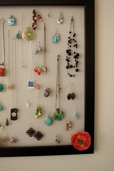
I was also pleased to see that she was sporting an adorable jewelry holder.

IMG_3831.jpg

She simply secured a screen to a large empty picture frame. It's functional and laden with cute accessories, so it looks like an art piece. Enough said.

IMG_3834.JPG

Aren't these ideas great?! I hope you like them as much as I do!! If you want to become of fan of Christine Otte Photography on facebook, you can do so here. I can assure you that you won't be disappointed!!

Happy Wednesday everyone!

E1025F317CFB5B8E9E5C526E5CC0F475.png

Tuesday, June 29, 2010

Big Brother & Sister Bags

Baby #3 is due in 5 weeks so I have been busy preparing big brother and sister for our new arrival. I wanted them to have something special waiting for them at the hospital so I created these big brother & sister bags...


I found the monogram templates here on Skip to My Lou. She shows you how to make simple applique monograms and gives you a template for each letter. Thanks, Cindy!

I found the bags at Hobby Lobby for $1.50 each. They are thin but perfect for my purpose.

I wish I had followed her tutorial completely because I went for the zig zag stitch, which I had never done before since I have only been sewing since November. My zig zag stitching skills are seriously lacking around corners and small circles. Yikes. The bags came out far from perfect, but that is okay with me and the kids will never notice! I am confident they will just be thrilled that their special letter marks their bag...


I found some cheap t-shirts at Wal-Mart. Pink for Avery and blue for Tyson, of course. I used scrap fabric to cut out letters to personalize each shirt. I first printed off the letters in the font I wanted from the computer. I cut out each letter and used them as stencils for the fabric. This was a very time consuming process but well worth it. After each fabric letter was cut out, I heat and bonded them to the shirts. I tried the machine at first, but I am just not good enough yet to sew tiny letters so I resorted to using my hands. These shirts may never get done before the baby gets here but I am trying...


Avery got a bonus of a coordinating skirt for fun. I would show you how I made the skirt, but my clothes sewing abilities are very limited. So while I love the finished product, my method of getting there is not worthy of repeating just yet!


Here are some other items that will fill the bags along with the shirts. A few dollar store items and a couple books found at a secondhand store in great condition. Nothing fancy but definitely fun...


The bags can later be used to hold books during library visits and to carry toys and such to family and friends houses!

Please join me in checking out these fun link parties!

Happy Tuesday!

Monday, June 28, 2010

Fabric Tray Liners

This next idea is so easy, I'm sure that everyone has already thought of it, but I just finally had the chance to try it out for myself and my home.

IMG_3716.jpg

I found this wooden tray at the thrift store last month and had big plans to pop off the handles to use for a frame tray like Patrice had made. But when I got home I realized that the wood was actually a beautiful oak, and I liked that it was round as opposed to a normal rectangular tray, so instead of just scrapping the base, I thought I'd just doctor it up a bit.

IMG_3558.JPG

I considered painting the bottom like on the "Eat" tray that I made last week, but I wanted to keep it versatile since I hadn't decided on a definite location for it in the house. So I decided to make some inserts for it instead.

IMG_3612.JPG

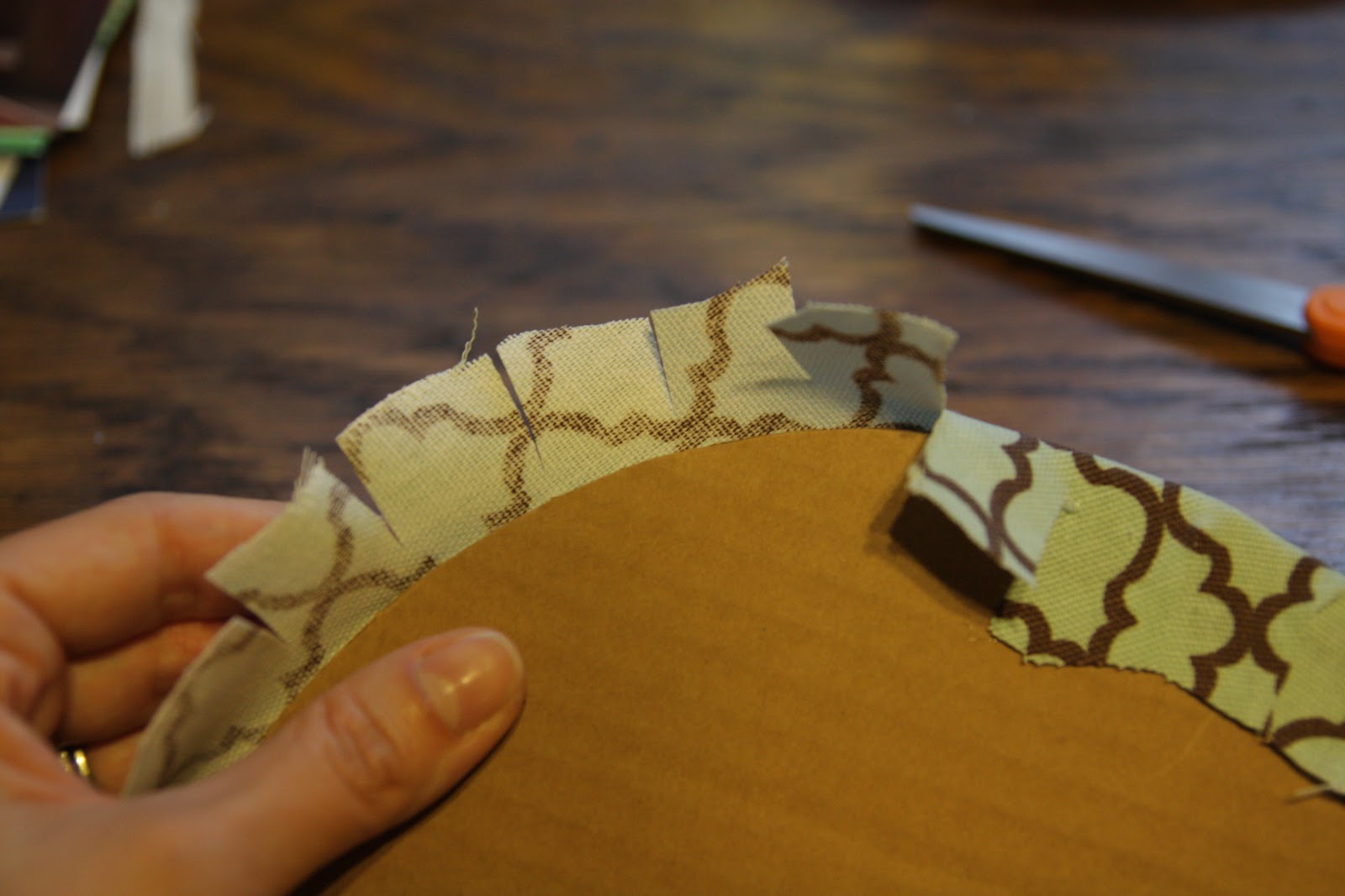
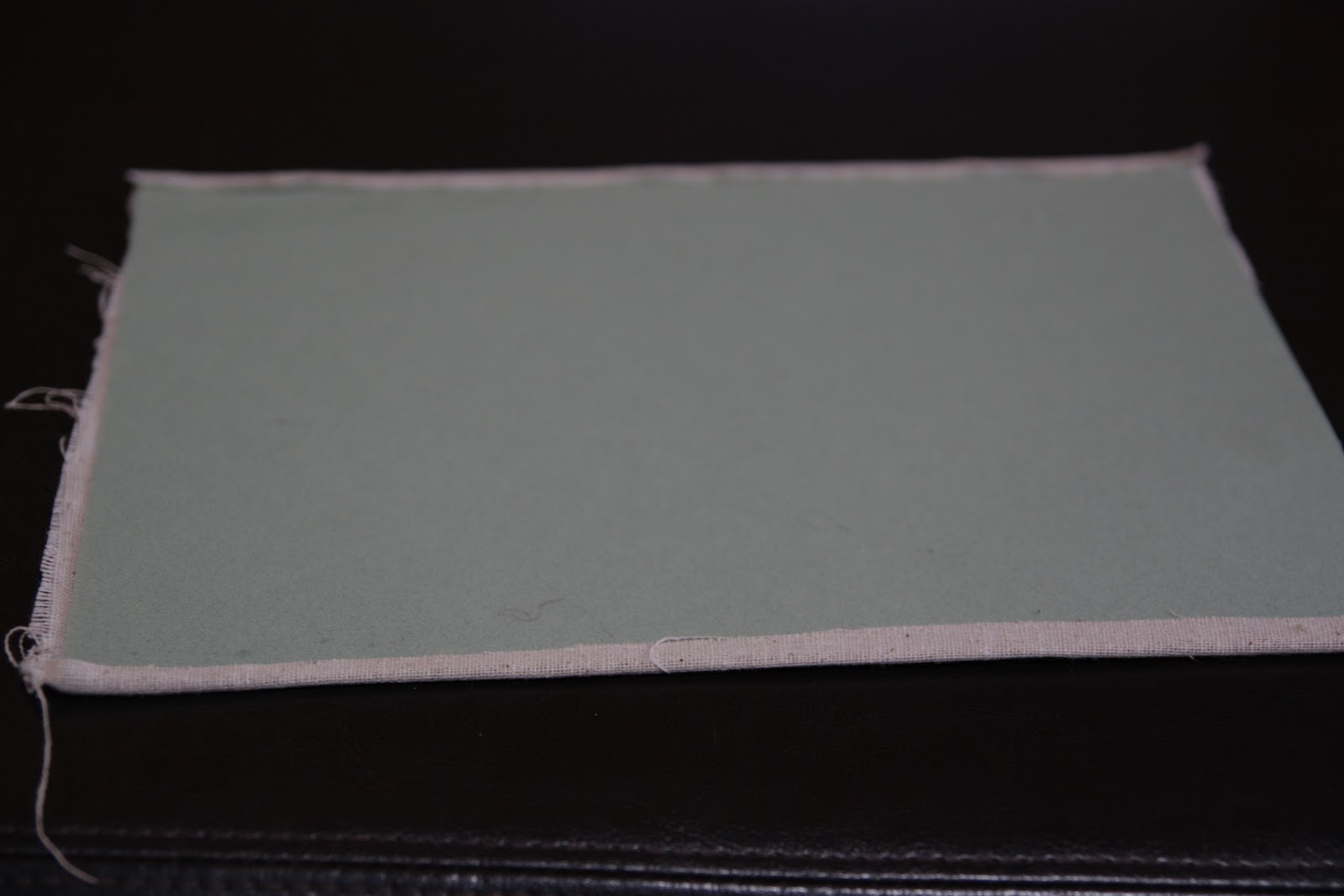
I cut a circle out of some cardboard and then cut a slightly larger circle out of some of this great fabric that matches my bathroom. I made little slits in the fabric and hot glued them down so that the fabric would overlap slightly and lay down flat.

IMG_3613.JPG

I wiped down the tray with some dark walnut stain, which filled in the cracks and brought the whole thing back to life. Then I just popped in my insert for a bathroom version.

IMG_3714.JPG


IMG_3720.jpg

I have wanted to find a way to get the word "Welcome" into my guest room but didn't really want to commit a sign to the decor, and this project provided the perfect alternative. I found a font that I liked on my computer, printed the word "Welcome" in a few different sizes, and tried them on the tray to see which size I liked best. When I found my favorite, I got a neutral muslin fabric, cut it down to slightly larger than a piece of paper, sprayed it lightly with spray adhesive and stuck it to some card stock. I then ran it through the printer and let the printer do the work.

IMG_3518.JPG

I can't even tell you how happy I was with this because there was NO STENCILING! And it turned out perfect!! Can you just imagine the possibilities for printing words and designs directly onto the fabric?! This is exactly what I was going for, but it turned out so well that my mind was just spinning over the possibilities.

[Edited to add: Thanks for the great response over the printing guys! I really don't have any secrets, but I will tell you what I did. I have an HP Inkjet Printer, and as to the settings, I simply made sure that it was not on the "fast print" option, which saves ink by using a lighter layer when printing. I also switched to a "print on card stock" option. Hope this helps!]

IMG_3530.JPG

I wanted the "Welcome" to be off-center so that I could put other things on the tray when people are coming over: decorations, flowers, mints, hand towels, etc.

IMG_3703.JPG

IMG_3711.jpg

What do you think? It was incredibly easy, and another one of those projects that I wish I had done much earlier.

Do you have any trays in your home that could be spruced up with a little fabric?

I'm linking to some amazing parties this week, so stop by to see everyone's summertime projects! I'll see you next week with one last tray project, my favorite one!

E1025F317CFB5B8E9E5C526E5CC0F475.png

Friday, June 25, 2010

Book Page Necklace

Now that I've gone through all of my parties so far, I thought I'd try my hand at a necklace. I love statement jewelry pieces. I find any occasion to wear them.


During recent travels, I saw this antique necklace worn by historic royalty. I thought I could definitely try my own version.


I found the 1 1/2 inch and 1/2 inch wooden beads along with satin ribbon at Hobby Lobby for 40% off, so I knew this was the project for me! I had tissue paper at home along with spray paint. I stopped by Half Price Books to find a fashion book on the clearance rack to use the pages. I pulled out my Mod Podge and got started.


For the book page beads, I used Erin's tutorial for her book page egg wreath. That was very helpful in knowing the best way to attach the pages to the beads. It was somewhat of a tedious process, but well worth it. I glued the center of the pages to the beads, then cut slits on both sides, and wrapped each piece trying my best to smooth them down.


As for the accent beads, I wanted to use a bold color. I love all things turquoise, plus I had turquoise tissue paper on-hand, so it worked out nicely. I ended up spray painting the beads a blueish color first just so the wood part wouldn't show through since the tissue paper was so thin. I wanted to add the tissue paper pieces to give more texture. After cutting the tissue paper into small, random pieces, I used Mod Podge to glue them on. I used a gloss Mod Podge at the end to coat both the accent and book page beads to give a shiny appearance.


I spray painted the 1/2 inch wooden beads black to use as spacers. I laid out the beads making sure the words on the book page beads were all facing out, so they would be the same direction when wearing the necklace. I used black satin ribbon to string the beads together and left the ends longer, so I could tie a nice bow in the back. You may notice I ended up with fewer book page beads than I originally laid out--this is because once I strung them together, the necklace seemed quite overwhelming. I took out a few beads to make it more of a choker-style (or as my husband refers to it as "Wilma Flintstone" style).


It was definitely a fun project to do and now wear. I'll be linking to these great parties this week. Check them out and see you in 2 weeks!

Thursday, June 24, 2010

Oversized Rosette Pillow

Rosettes have been floating around out there for a long while now, and I must say while I think they are completely fabulous, I hadn't really tried my hand at anything similar. I had played around with the shapes using ribbon and what not, but had never settled on a reason for needing them, nor was I completely satisfied with how mine turned out. All of this changed, however, when I decided what I needed for my couch was just one more pillow. I wanted a small pillow that had a lot of character, and I settled on this:


For obvious reasons I have been calling it my GIANT rosette pillow. While the pillow only measures about 10inx10in, the rosette is still close to 10 inches in diameter. With just a little thread, needle, leftover fabric and hot glue (of course!) it was very simple to create.

First I hand stitched a pillow 10in x 1oin and filled it with cheap Walmart stuffing, ($3.00). The thing I like about this pillow that it is made from upholstery grade fabric left over from a rocker I upholstered. Just being slightly thicker than other fabrics I have used in the past, it give the rosette some added depth I think.

Next, I cut my remaining fabric into 2 inch strips. The rosette took SEVERAL of these to complete.


With the strips cut, I began the rosette by kind of rolling the outsides of the fabric together to create a sort of fabric tube. This made the 'petals' a little more voluminous.


Next, I just began rolling the fabric inward, twisting it as I went. You have probably seen a lot of tutorials on how to best achieve this. I cannot say that I really used any one technique, but more just went with the flow. This is where, for me, the hot glue came it. I do not proclaim to be a seamstress. Hand stitching a pillow is about as good as it gets. Therefore, I was left with other adhesive options for securing my rosette, and turned to hot glue. I do not have a picture of the places where I put hot glue. I can just say its easiest to to dab a bit, around the bottom of the rosette petals, about every inch or so. As the rosette gets bigger, it works best to apply the hot glue in thin strips around the bottom of the fabric.


When the rosette became to large to hold, I then attached it to the pillow (using hot glue, I know I am a cheater!). I secured it to the pillow with hot glue in many places, pulling at the rosette as I went to test for stability.


Below is a picture of the where I got my fabric inspiration. While the colors in this great fabric matching NOTHING else in my living room, the play off of each other from across the room. Now the fabric choice seems to make a little more sense. (And trust me, they are not staying together, that matchiness would probably just eat me alive!)


I can't wait to share with you how I rescued this antique rocker, along with some other upholstery ideas in the next few weeks.


Hope you enjoyed my 'late on the scene' version of the rosette!

I will be linking to this week's CSI pillow challenge! Hope to see you there...

Visit thecsiproject.com